
Today, nearly two-thirds of all web traffic comes from smartphones and tablets. In fact, as of May 2025, mobile devices account for 63% of UK website visits. If your website isn’t mobile-first—that is, designed primarily with mobile users in mind—it’s likely losing visitors, rankings, and revenue.
But designing for mobile alone isn’t enough. Accessibility has become essential, both to meet legal standards and to serve the broadest possible audience. In the UK, the Public Sector Bodies (Websites and Mobile Applications) Accessibility Regulations 2018 set clear rules based on the WCAG 2.2 standards. Although these rules directly apply to public-sector sites, all UK businesses have obligations under the Equality Act to ensure their websites are accessible and inclusive to everyone.
In this article, we’ll explore how your website can meet both demands: optimised for mobile devices and inclusive for all users.
Seven Practical Steps for Mobile-First and Accessible UX
1. Fluid Grid Layouts
Instead of designing websites for desktops first and shrinking them down, mobile-first design starts with smaller screens. Use fluid grids, a flexible layout approach created with CSS (Cascading Style Sheets), to ensure your content adapts smoothly to any screen size. Tools like a WordPress page builder with responsive presets can help you do this effectively.
Why it matters: Users stay longer when content comfortably fits their screen without pinching or zooming.

2. Clear, Readable Fonts
Readable text is essential for accessibility. Choose fonts that are easy to read at a glance, set at a minimum of 16 pixels in size. Using modern variable fonts (fonts that adjust their size and thickness smoothly) reduces loading times and improves readability.
Why it matters: Readable fonts help everyone, especially users with visual impairments or dyslexia.
3. Colour Contrast and Dark Mode
Ensure your text and background colours have enough contrast (at least a 4.5:1 ratio) to make your site readable for everyone. Offering a dark mode (a darker background option) can further enhance readability, reduce eye strain, and accommodate user preferences. Many modern websites now include a simple toggle allowing visitors to switch easily between modes.
Why it matters: Proper contrast and colour choices improve readability for people with colour blindness or reduced vision.
4. Touch-Friendly Design
WCAG 2.2 includes a guideline called Target Size, recommending interactive elements, such as buttons and links, be at least 48×48 pixels to make them easier to tap on small screens. Also, indicate when elements like links or buttons are selected or hovered over to guide users who navigate with keyboards or screen readers.
Why it matters: Large and clearly defined clickable areas improve usability for people with mobility issues or anyone using touch devices.
5. Semantic HTML and ARIA
HTML elements should represent their purpose—for example, used <nav> for navigation menus or <header> and <main> for layout. Combine this practice with ARIA (Accessible Rich Internet Applications) attributes to describe interactive elements for screen readers.
Why it matters: Screen-reader users rely on accurate descriptions and structure to navigate websites effectively.
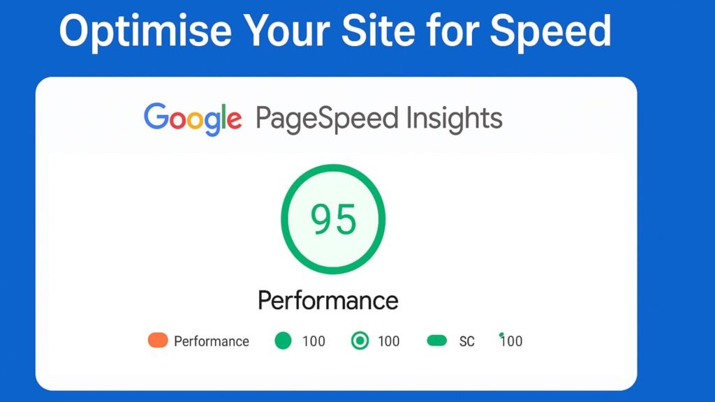
6. Optimise Your Site for Speed
Google’s Interaction to Next Paint (INP) measures how quickly your site responds to user interactions (like clicks and taps). Ideally, responses should happen within 200 milliseconds. Improve this metric by:
- Using lazy-loading to load images when users scroll down.
- Compressing images and serving them at appropriate sizes for different devices.
- Prefetching fonts and using minimal CSS for faster loading.
Why it matters: Fast websites rank higher in Google and keep visitors engaged longer, improving both SEO and user experience.
7. Personalisation Without Excluding Users
Offer personalised experiences while respecting accessibility. Allow users to set preferences such as dark mode, reduced animations (to help people sensitive to motion), and font size adjustments. Store these settings in a user’s browser (using localStorage) to avoid slow load times or intrusive cookie consent banners.
Why it matters: Personalisation enhances usability and comfort without compromising privacy or speed.
Quick Self-Audit: How Mobile-First & Accessible is Your Website?
Ask yourself:
- Does every page pass Google’s Mobile-Friendly Test?
- Are your clickable elements at least 48 pixels?
- Does your site meet the WCAG 2.2 contrast guidelines?
- Can users navigate effectively without a mouse?
- Is your accessibility statement up-to-date?
If your answer to any of these is no, it’s time to upgrade your site’s UX
Conclusion: From Compliance to Competitive Advantage
Creating a genuinely mobile-first and accessible UX isn’t merely about ticking boxes; it boosts your site’s visibility, improves customer engagement, and positions your brand as inclusive and forward-thinking.
Whether you’re refining your site speed, looking to become WCAG compliant, or aiming for better search rankings, investing in mobile-first, accessible design is a win-win for your users and your business.